Remote
Florian Hardwig
@fhardwig@mastodon.social
 mastodon 4.8.0-nightly.2026-10-06
1111 Followers
518 Following
24 Posts
Joined August 12, 2018
Fonts In Use:
Kaune & Hardwig:
Mark your calendars: the anniversary edition of Mastering Type will be shown on 25 and 26 April at Kulturforum Berlin.
The event provides insights into contemporary type design education; with an exhibition of 350+ graduation projects made in the past decade at @TypeMedia@typo.social, Écal, @ANRT@typo.social, @esadtype@mastodon.social, University of Buenos Aires, University of Reading, and @typeparis@mastodon.design; as well as lectures and workshops. Organized by Luc(as) de Groot @LucasFonts@typo.social and the @typostammtisch@typo.social team.
https://www.smb.museum/en/museums-institutions/kunstbibliothek/exhibitions/detail/mastering-type/
RE: @jaf@typo.social
👀 Easily in my top three of best books on type design. Happy to see a new edition in the works. If you don’t have it already, make sure to secure a copy. More info on Tim & Shoko’s website:
https://justanotherfoundry.com/size-specific-adjustments-to-type-designs
My favorite use of PLINC’s Caruso Roxy: the covers for a series of creative activity books by Grace Mintonye and James E. Seidelman, published by Crowell-Collier Press from 1967 on.
See all of seven on @FontsInUse@typo.social: https://fontsinuse.com/uses/42135/creating-book-series-by-james-e-seidelman-and
Berliners: we have a space available in our shared studio! Mitte/Kreuzberg, U8 H.-Heine-Str., in a nice community of 16 designers, illustrators, writers, animators, artists. Reasonable rates. With kitchen, wifi, shared printer.
Details per DM or mail. Boosts welcome.
Replying to
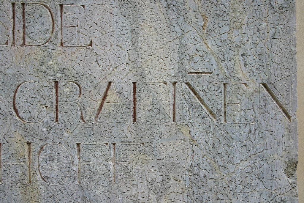
@fritz_groegel @koeberlin Dieser Überstrich war besonders beliebt bei m und n, um die sonst verwirrend hohe Zahl der Bögen zu verringern. Wurde aber auch auf andere Buchstaben inkl. Versalien übertragen. Beispiele in den Kommentaren: https://www.flickr.com/photos/hardwig/6388399531/
Replying to
@herzberg@typo.social Not too much. I can tell you that design already appeared in a catalog by Deberny & Cie from around 1908, 15 years before the foundry merged with Peignot & Fils. It’s shown as Écritures lithographiques, which is more of a genre than a proper name. No note about the designer, but likely in-house.
Three sizes with a common baseline. Cast on sloping bodies, with overhangs. With alternate and/or size-specific forms.
https://bibliotheques-specialisees.paris.fr/ark:/73873/pf0000948850/v0217.simple.selectedTab=record
1/2
Bittersweet mood at Berlin’s #Buchstabenmuseum today, with lots of folks paying a last visit before it closes for good.
https://www.buchstabenmuseum.de/en/visit/
The museum is looking for long-term storage for its collection. You can support it by donating: https://www.betterplace.org/de/projects/118807-rettung-gebauter-schriftzuege
Replying to
@djrrb @FontsInUse Thanks, David! Sometimes a weekend just isn’t long enough for a weekend special, and spills over to Monday. More grooviness has been added today. 😅 But now we’re done with Caruso Roxy & co., I think.
Plain Text #1 has arrived and is looking enticing! The first issue of @plain_form@typo.social’s printed publication for exploratory type design has contributions by Anne-Dauphine Borione (Daytona Mess), Lucas Descroix, Benjamin Dumond @grifi@piaille.fr, Kirsten D. Dzwiza, Stefan Ellmer @thepytefoundry@typo.social, Ayasha Khan, Zuzana Licko, Arman Mohtadji, William Skeen, and Verso Wurm. Texts in English and French ➽
https://text.plain-form.com/en/shop/plain-text-1
Replying to
@herzberg@typo.social By 1916, the fourth size was added: https://bibliotheques-specialisees.paris.fr/ark:/73873/pf0000948848/v0275.simple.selectedTab=record
More samples in a 1920 specimen: https://archive.org/details/lelivrettypograp00fond/page/168/mode/2up
2/2
Replying to
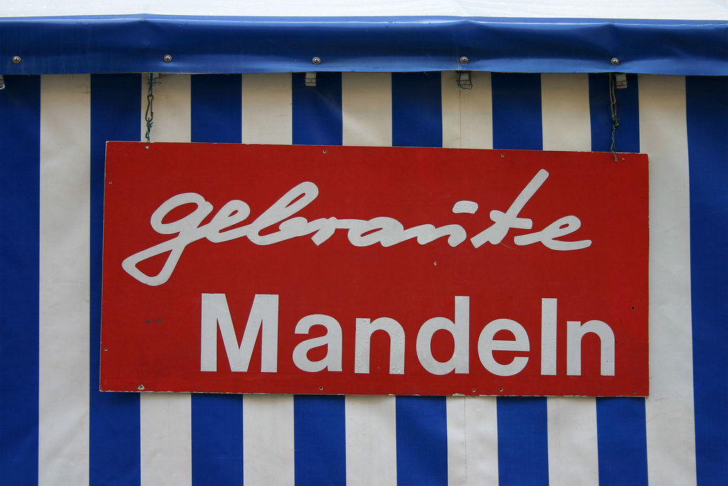
@codepoints @koeberlin @fritz_groegel Nicht zu vergessen die Umlaut-Pünktchen, die in Handschrift auch mal zu einem Strich verschliffen werden.
Oft kommt zum Glück der Kontext zu Hilfe. Auch waren in den wenigen mir bekannten Fällen, in denen beide Stricharten parallel vorkamen, jene auf dem u betont gebogen, die anderen akkurat horizontal.
Aber ja, es gibt Ausnahmen, wo nicht sofort klar ist, ob der Strich ein u oder ein doppeltes n markiert: https://www.flickr.com/photos/hardwig/6701629879/
Replying to

Replying to
@martabernstein@typo.socialhttps://www.flickr.com/photos/hardwig/4373276189/in/album-72157622847839978/
Wagner Zip-Change has the right letterforms and Double D NF about the right faceting. I’m not aware of a font that brings together both.
https://fontsinuse.com/typefaces/17981/double-d-nf
https://www.fontspace.com/wagner-zip-change-font-f10468

Replying to
@grautesk @koeberlin “Tot.” steht üblicherweise für totus – Latein für ganz (unzerteilt/unverdünnt).
Replying to
@joanacorreiatype Why not mention the typeface’s name? ;-) It’s Tempo https://fontsinuse.com/typefaces/4539/tempo … and Middleton’s geometric sans has long been due for a proper digital interpretation. Congrats for making it happen!
Also, any reason why the typeface page https://roosterfonts.com/fonts/tempo/ doesn’t mention the involved designers? I was wondering who was behind it. @robkeller @thetypefounders (I do see now that they’re credited on @TypographerApp).
Over on Flickr, @henriquenardi@mastodon.social (Tipocracia) shared photos from @Typographics@typo.social 2025:
https://www.flickr.com/photos/tipocracia/albums/72177720327265982/
Another useful thing bites the dust. Monotype apparently has discontinued the WhatTheFont forum, after nearly 19 years and half a million solved cases, and without communicating the decision to the community of tireless volunteers:
“They seem to have in a haphazardous way shut us down.”—Jackie https://www.myfonts.com/pages/wtf-case?case=1688039/
Old entries are still up, but new cases can no longer be posted. Via @akira1975@typo.social
See http://fontid.co/ for an alternative @FontID@typo.social forum.
Replying to
@ksmallgallery How about a family with finely graded weights and/or ideally optical sizes, and then creating your own superiors via a character style that defines a sturdier style with baseline shift (plus fine-tuned spacing)? Would that be an option?
Replying to
@typographica@typo.social @jaykay109@mstdn.social @FontsInUse@typo.social
For the record, Patrick Concannon (who is not on Masto AFAICT) submitted a post about this book cover a while ago. (It’s not published yet because there are SO MANY submissions.) He tagged Techni-Process’s Casual Interlock. We’ll make sure to reference your blog post and Safari.
Replying to
@simonwalker@typo.social Did you know that the Montreal sign that provided the inspiration is loosely based on Motter Femina? https://fontsinuse.com/typefaces/7801/motter-femina
I love me such unintentional(?) reinterpretations based on a few sample glyphs – lovely to see where you took it.