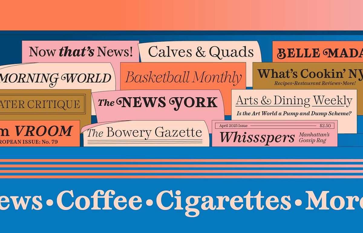
I’ve started a new series interviewing type designers on how they got into type and how they stay creatively satisfied. This month, I spoke with Amy Hood of Hoodzpah —

 mastodon 4.8.0-nightly.2026-10-06
Human, being.
Designer @ Adobe Fonts.
LA 🌴☀️
Thoughts on fonts, typography, front-end development, UI, and UX.
I’ve started a new series interviewing type designers on how they got into type and how they stay creatively satisfied. This month, I spoke with Amy Hood of Hoodzpah —
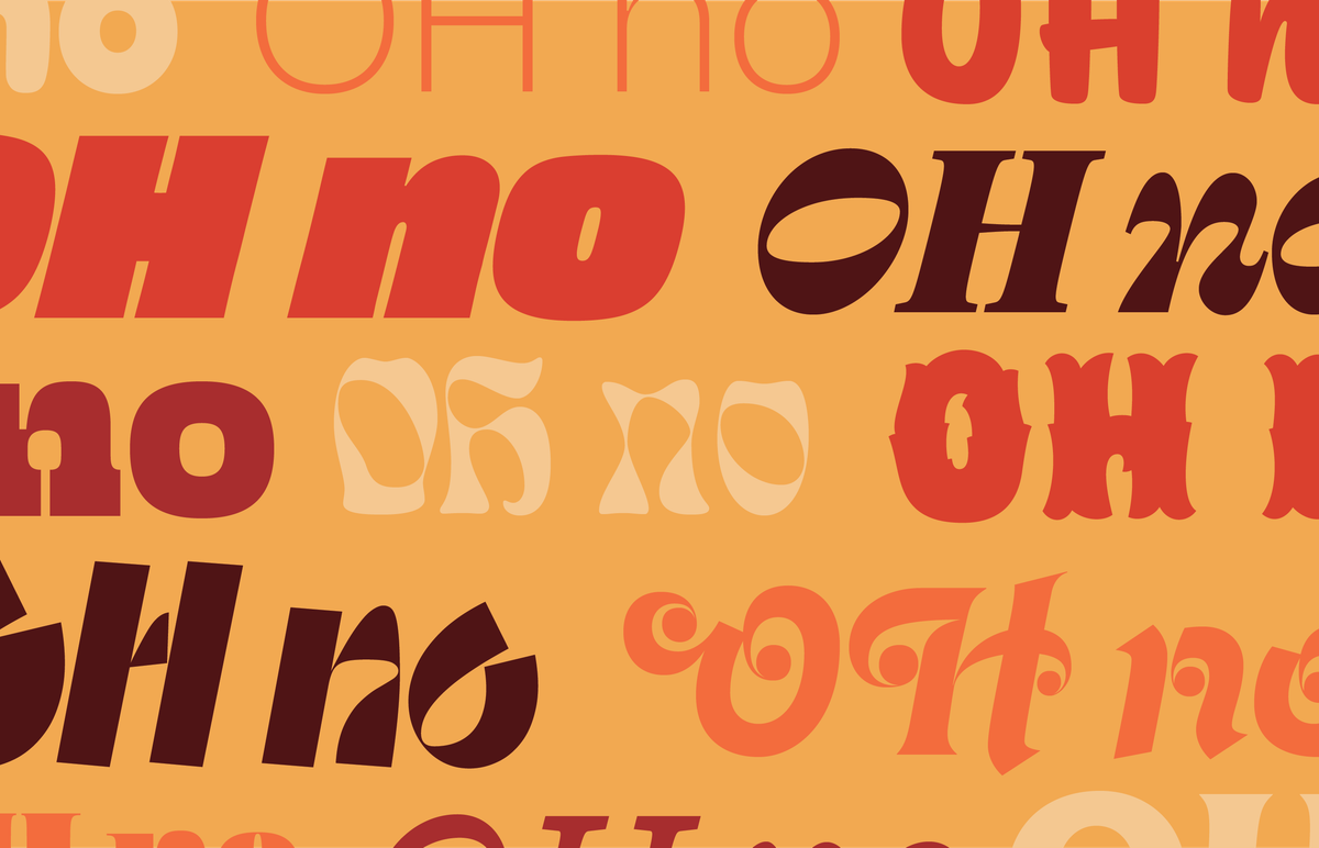
Next up in Making Type: OH no Type Co.’s James Edmondson on his start in type, design process, and how he stays creatively satisfied —
https://maketypework.com/making-type-james-edmondson-of-oh-no-type-co/
Back to the important work of investigating which fonts Taylor Swift is using
@scott@typo.social ooo perfect, thanks!
Does anyone know of any good resources for restaurant menu design? My searches are flooded with pretty mediocre templates and I’m looking for some nicely made real inspiration.
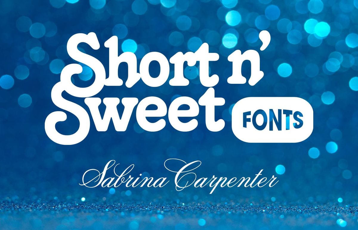
Sabrina Carpenter was my top artist for a second year in a row (make of that what you will) so naturally I had to look into the fonts she uses:
https://maketypework.com/sabrina-carpenter-short-n-sweet-tour-fonts/
@scott@typo.social of course there’s only one right answer here
@fonts@sfba.social *clicks on navigation 100 times in a row to watch animation*
@kizu@front-end.social @piccalilli@front-end.social @5t3ph@front-end.social Hello clever people, I’m trying to wrap my head around if it’s possible to use container queries and a variable font with a width axis to basically do fit-text+ (i.e. prioritize getting the font narrower before getting smaller as the container shrinks)
Is this something any of you have come across?
When you think of 'plain text' what font do you think of?